Ahead of the UN’s pivotal climate change conference in Glasgow this year, Johnson Banks has designed a fluid, colourful identity that makes climate change everyone’s problem.
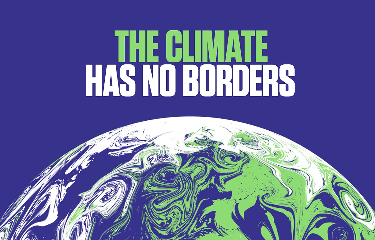
The identity is centred around the earth – a simple icon, but not without its differences. Deep blues and greens are traded for a purple, white and lime palette, while borders are all but effaced by a beautiful marbling effect evocative of swirled paint. The image of the earth is also used as part of an eye which, for some, may bring to mind Monsters, Inc, but does neatly bolster the claim that “the world is watching”.

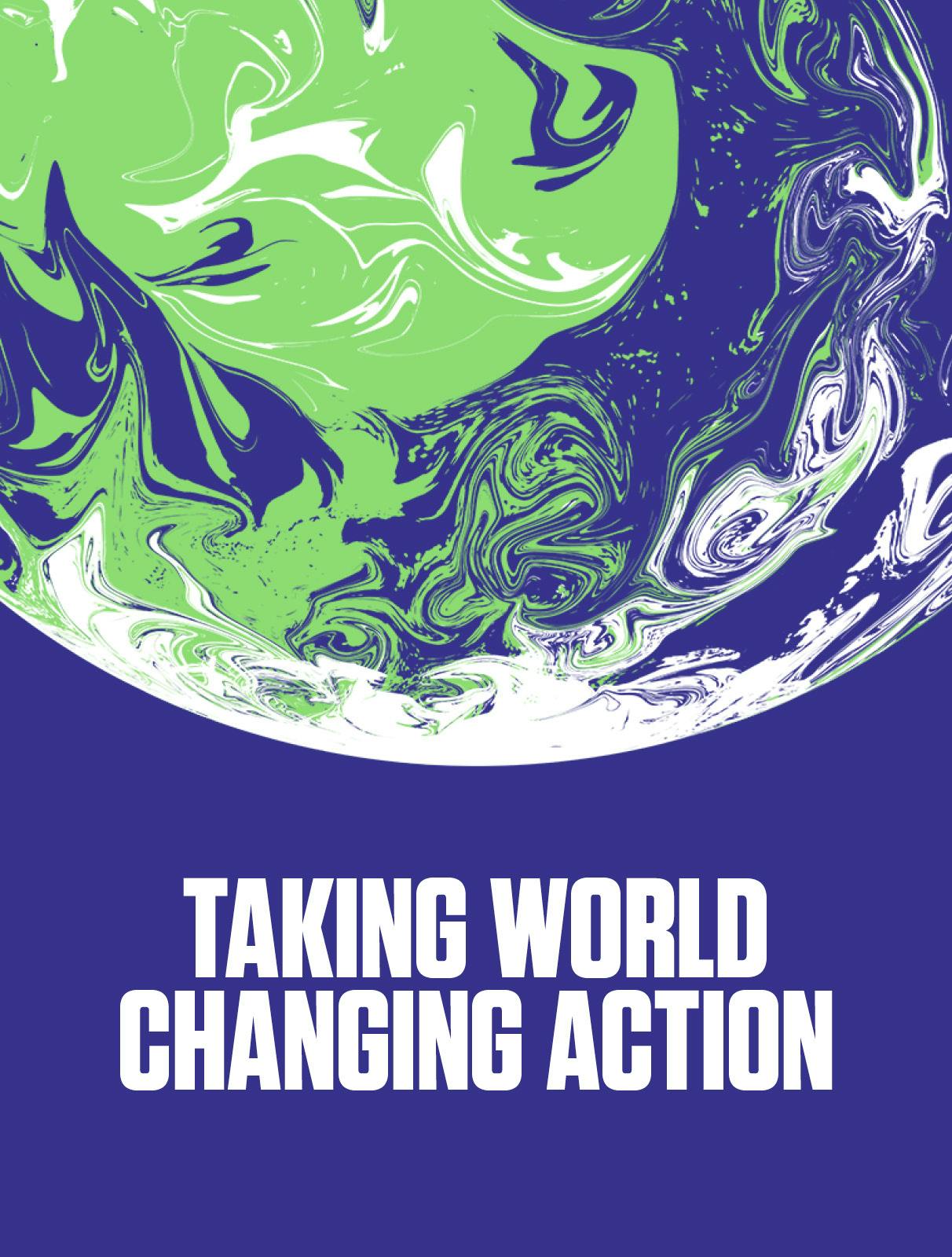
“The swirling coloured globe illustrates that the climate has no borders, alludes to currents and weather systems – and is intentionally beautiful,” reads a statement on the project. “It deliberately avoids directly using recognisable country shapes and is designed to fascinate people, wake them up and compel them to take urgent action to save our precious planet.”
The adapted colour scheme was chosen to complement the more “metaphorical” approach. “Just using traditional blues and green seemed a bit obvious, so by using brighter, more RGB colours we can show that this is a new take on traditional ‘world’ imagery,” explains founder and creative director Michael Johnson.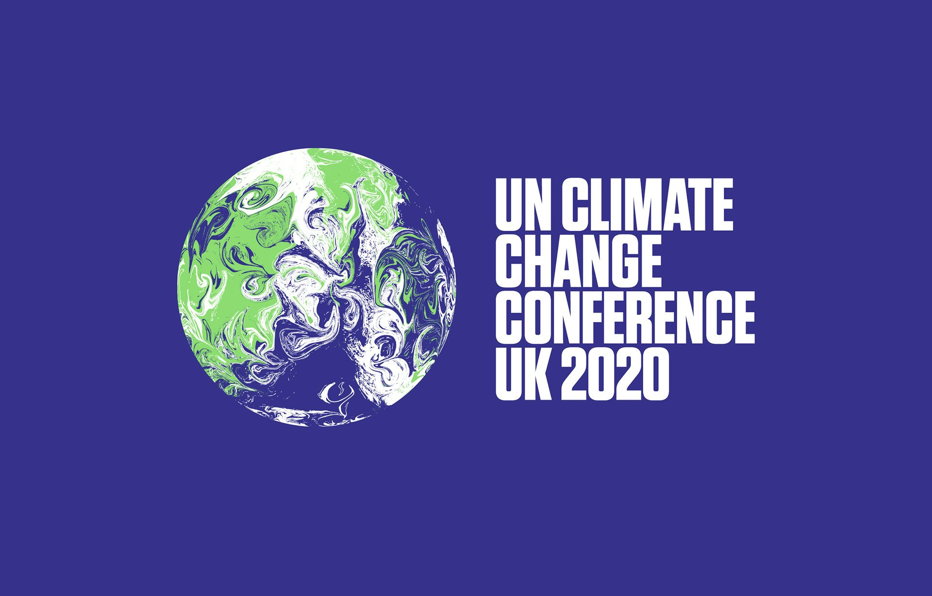
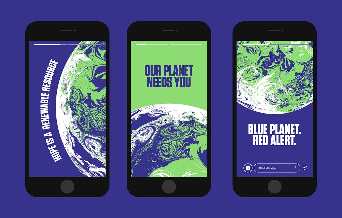
“We looked at a range of design approaches, from ‘neutral’ to ‘agit’ and it quickly became clear that for the Cabinet Office (our client) something that was hectoring or ‘angry’ might prove counter-productive,” Johnson told us. “As we developed three routes, the swirling globe became a clear favourite because we could use quite strident language with it, whilst we could all imagine it slowly turning throughout a three-day conference without driving anyone crazy!
