Leva’s brand identity illustrates the realities of chronic pain.

Founded by a group of pain specialists and using a new treatment model that combines physiotherapy, psychology and medication, Leva is the UK’s first online chronic pain clinic, aiming to help people with persistent pain lead a better life.
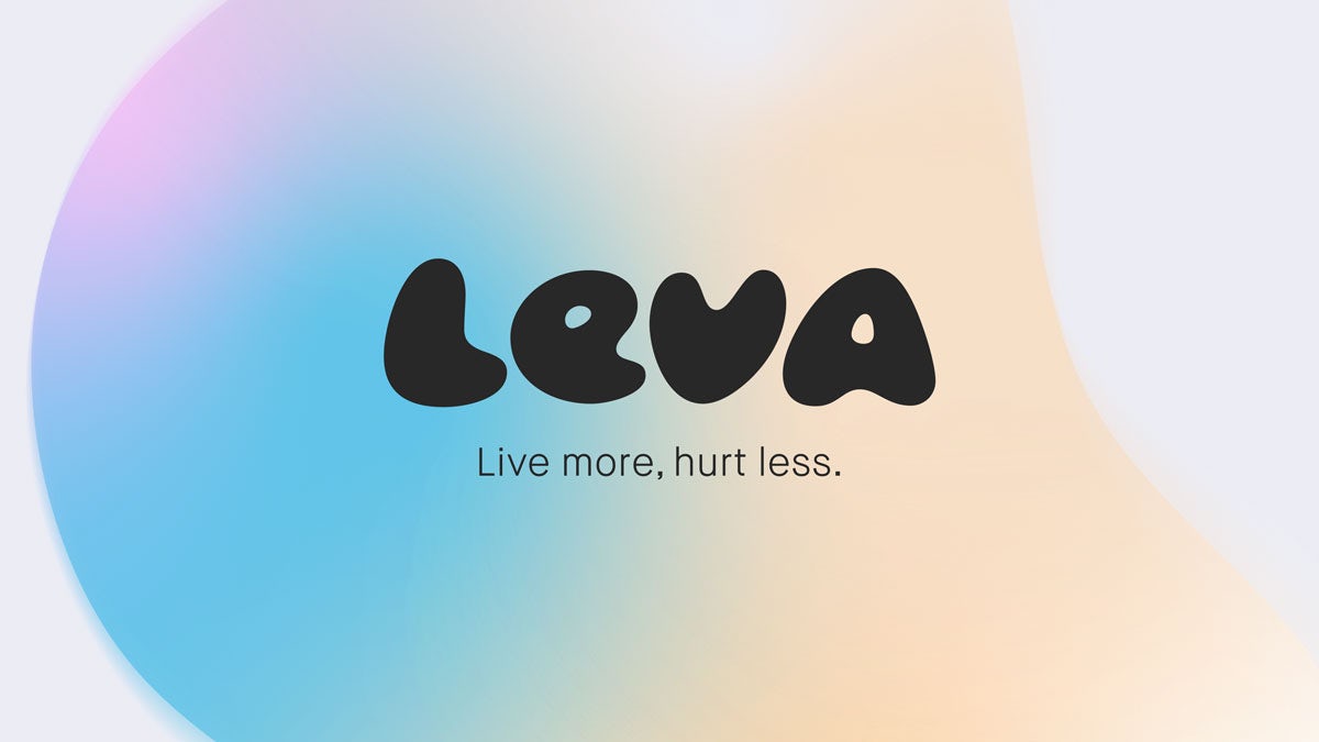
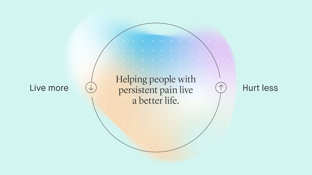
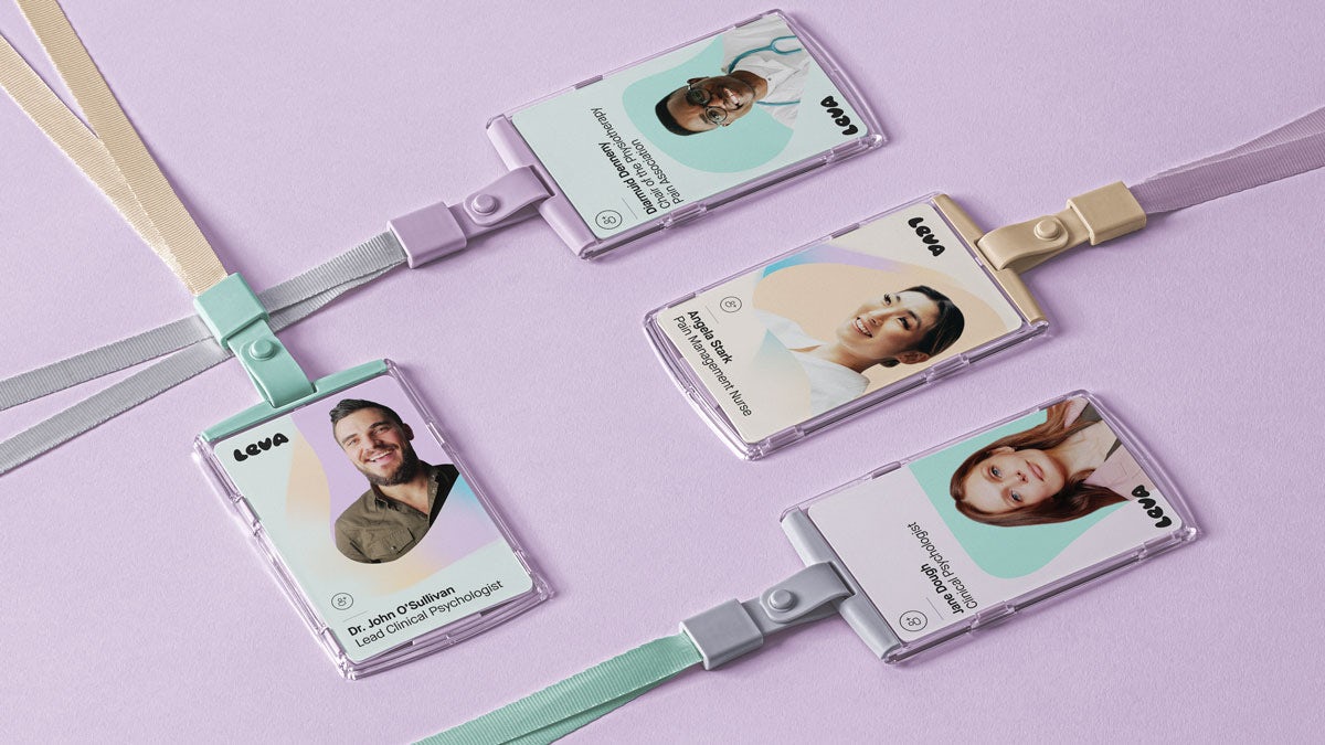
Ahead of Leva’s launch, the team behind the clinic worked with London-based agency That Thing over a period of six months to define its brand. “Leva presented a great challenge: how do you create a brand that mixes a real caring humanity with expertise and rigour? We knew it couldn’t feel too soft but it couldn’t feel too clinical either. The result walks the line and is helping Leva to reach an audience that needs them,” says the agency’s co-founder, Joe Weir.

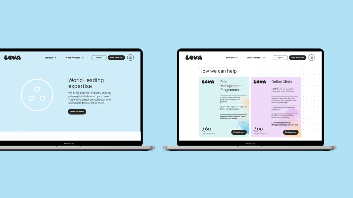
After naming the product ‘360 care’ and breaking down the treatment into ‘Mind, Movement, Meds’, the agency created a logo that reflected the clinic’s triangular approach to patients’ treatment. The rest of the design system is divided into two parts: soft and nurturing, and accurate and disciplined.
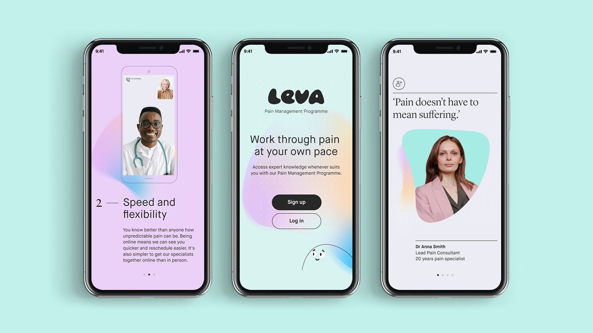
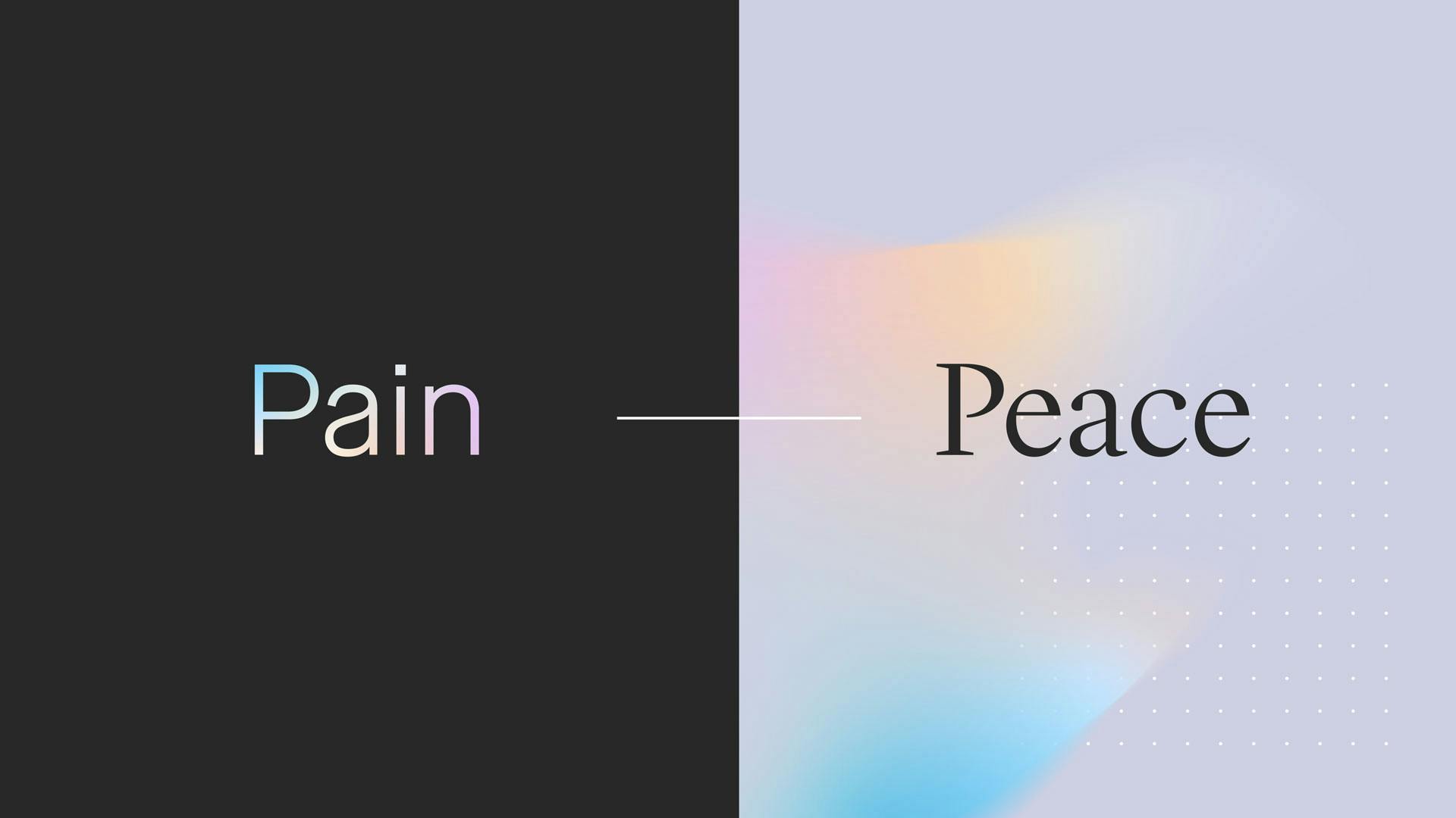
“To help evoke the feeling of pain, we reversed our design language and created a moody dark mode. Soft, free-flowing auras are contained within the typography, precluding the core ‘peaceful’ identity which becomes the pay-off,” says the agency.
Leave a Reply

Fill in your details below or click an icon to log in:

WordPress.com Logo

You are commenting using your WordPress.com account. Log Out /  Change )

Twitter picture

You are commenting using your Twitter account. Log Out /  Change )

Facebook photo

You are commenting using your Facebook account. Log Out /  Change )

Connecting to %s